 51工具盒子
对于未对中国大陆优化的博客站点而言,图片懒加载几乎是必备的功能,它能够有效提高页面的首屏速度。静态站点的懒加载方案有很多,但都必然会带来布局偏移的问题,影响页面的 CLS 分数 。
本文将基于浏览器原生懒加载和 Hugo 使用的 Golang html/template 模板引擎,实现图片懒加载和对不同比例自适应的 CSS 图片占位。
懒加载实现 {#懒加载实现}
图片懒加载有很多实现方式。很久以前有基于 jQuery 的 Lazy Load ,如今随着 jQuery 退场几乎不再使用了;后来有基于原生 Intersection Observer API 实现的 vanilla-lazyload ,可以基本上符合懒加载的需求。
随着越来越多曾经的第三方 JS 实现的功能被标准化,针对图片和 iframe 的浏览器原生的懒加载出现在了 HTML 标准 中。在写下这篇文章的 2022 年中旬,根据 Can I use ,Chrome 77+、Edge 79+、Firefox 75+ 和 Safari 15.4+ 均支持了对图片元素的原生懒加载。

作为一个仅对最新大版本提供支持的博客,使用原生懒加载已经不成问题,且原生懒加载的策略由浏览器决定,可以随着版本更新而优化,实现也非常简单:
<img src="https://example.org/img.jpg" loading="lazy" alt="Lazy Image" />
</code>
</pre>
布局偏移问题 {#布局偏移问题}
凡是懒加载的图片,必然会出现布局偏移的问题。在图片加载前,图片占据高度为 0,而图片加载后,图片占据高度可能会发生变化,从而导致布局偏移。
布局偏移问题的常规解决方案如下,以全宽图片为例:
-
将 img 元素放置在两层 div 容器中
-
设置外层容器的 position 属性为 relative , width 为 100%
-
设置内层容器的 height 为 0 , padding 为图片宽高比
-
为最外层容器设置占位背景色
.fiximg {
position: relative;
display: block;
overflow: hidden;
background-color: var(--color-wrapper);
width: 100%;
&amp;__container {
display: block;
width: 100%;
height: 0;
margin: 0;
padding-bottom: '&lt;ASPECT RATIO HERE&gt;';
img {
display: block;
width: 100%;
margin: 0;
color: var(--color-primary);
font-size: inherit;
text-align: center;
}
}
}
&lt;/code&gt;
&lt;/pre&gt;
但是,对于博客文章而言,插入图片的宽高比是不确定的,因此将固定宽高比的效果非常一般。
Go HTML 模板实现 {#go-html-模板实现}
本站的静态网页生成器 Hugo 使用 Golang 的 html/template 模板引擎实现模板。
本站的图片资源结构是分散式的。对于每篇文章,Hugo 都存在 https://gohugo.io/content-management/page-resources/ 这一概念,即在每篇文章的 index.md 同目录下的资源文件会被 Hugo 认为是该文章特有的资源。
Hugo 在渲染插入图片时,允许通过 https://gohugo.io/templates/render-hooks/ 的方法对渲染的 HTML 进行自定义,因此主要的实现就在这之中进行。
首先创建 layouts/_default/_markup/render-image.html 文件,获取图片资源:
{{ $image := .Page.Resources.Match .Destination }}
{{ if ge (len $image) 1 }}
{{ $image = index $image 0 }}
{{ else }}
{{ warnf &quot;Image not found \&quot;%s\&quot;&quot; .Destination }}
{{ end }}
&amp;lt;/code&amp;gt;
&amp;lt;/pre&amp;gt;
获取图片后,解析图片的宽高,并将宽高乘上 1.0 转换为浮点数:
{{ $imageHeight := mul $image.Height 1.0 }}
{{ $imageWidth := mul $image.Width 1.0 }}
{{ if or (lt $imageHeight 1) (lt $imageWidth 1) }}
{{ warnf &amp;quot;Image not valid \&amp;quot;%s\&amp;quot;&amp;quot; .Destination }}
{{ end }}
&amp;amp;lt;/code&amp;amp;gt;
&amp;amp;lt;/pre&amp;amp;gt;
随后,根据宽高计算图片的宽高比,并生成底部 padding 的内联样式:
{{ $ratio := mul (div $imageHeight $imageWidth) 100 }}
{{ $css := printf &amp;amp;quot;padding-bottom: %.4f%%;&amp;amp;quot; $ratio }}
&amp;amp;lt;/code&amp;amp;gt;
&amp;amp;lt;/pre&amp;amp;gt;
最后,根据图片宽度,为大图设置全宽,小图设置为原始宽度,并输出 HTML 即可:
````go
{{ $width := &amp;amp;quot;width: 100%;&amp;amp;quot; }}
{{ if le $imageWidth 652 }}
{{ $width = printf &amp;amp;quot;width: %.0fpx;&amp;amp;quot; $imageWidth }}
{{ end }}
&amp;amp;lt;/code&amp;amp;gt;
&amp;amp;lt;/pre&amp;amp;gt;
```html
&amp;amp;lt;!-- goldmark will insert p tag before &amp;amp;amp; after image div so theres no need to wrap it with p tag --&amp;amp;gt;
&amp;amp;lt;div class=&amp;amp;quot;fiximg&amp;amp;quot; style=&amp;amp;quot;{{ $width | safeCSS }}&amp;amp;quot;&amp;amp;gt;
&amp;amp;lt;div class=&amp;amp;quot;fiximg__container&amp;amp;quot; style=&amp;amp;quot;{{ $css | safeCSS }}&amp;amp;quot;&amp;amp;gt;
&amp;amp;lt;img loading=&amp;amp;quot;lazy&amp;amp;quot; src=&amp;amp;quot;{{ $image.Permalink }}&amp;amp;quot; alt=&amp;amp;quot;{{ .Text }}&amp;amp;quot; /&amp;amp;gt;
&amp;amp;lt;/div&amp;amp;gt;
&amp;amp;lt;/div&amp;amp;gt;
```
效果预览 {#效果预览}
------------
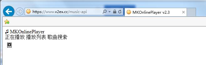
以这篇文章上文的图片为例,加载前:
&amp;amp;lt;br /&amp;amp;gt;

&amp;amp;lt;br /&amp;amp;gt;
加载完成后:
&amp;amp;lt;br /&amp;amp;gt;

&amp;amp;lt;br /&amp;amp;gt;
````